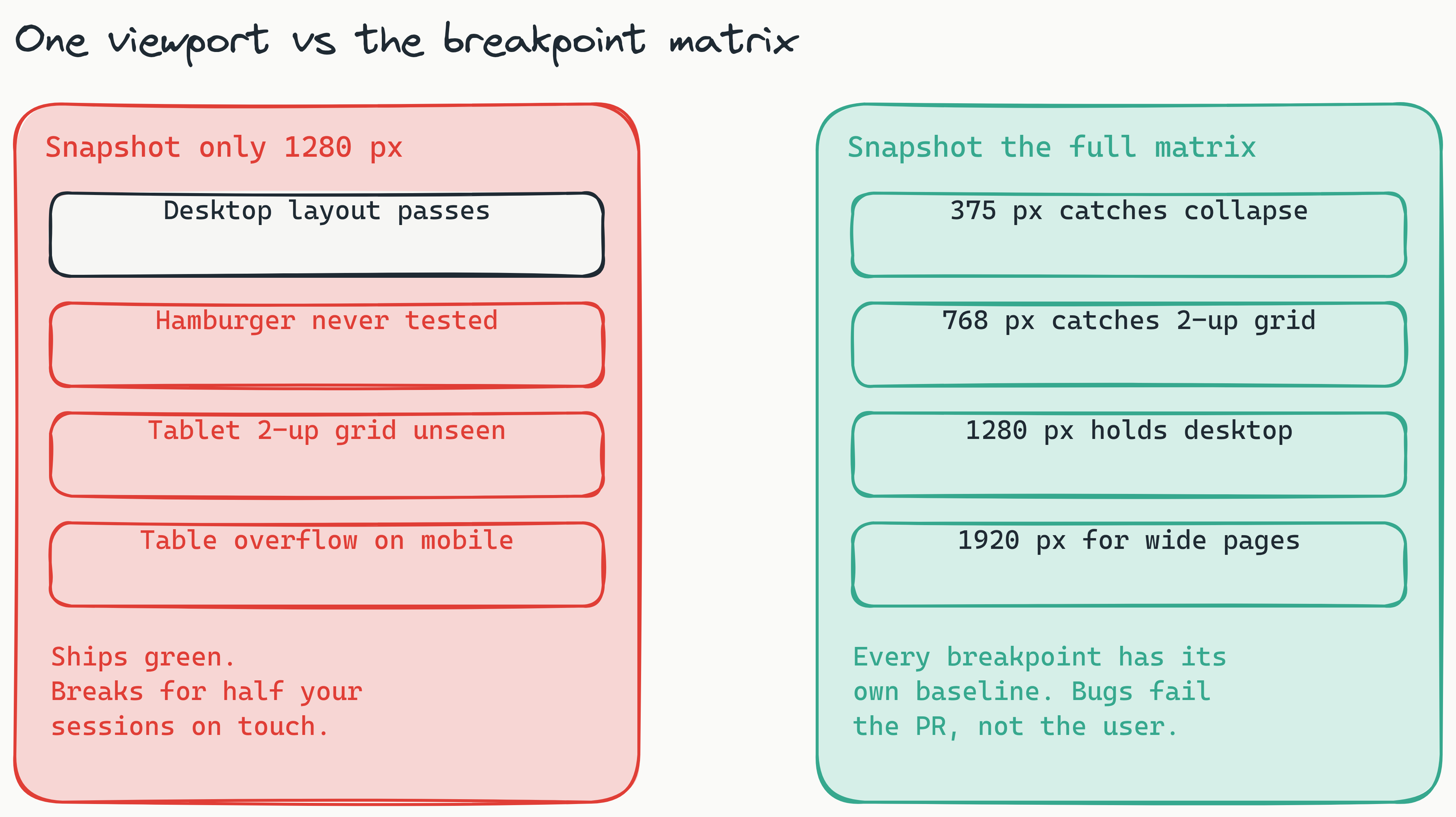
"Looks fine on my laptop" is the most expensive sentence in front-end engineering. Half of all user sessions happen on mobile, but visual testing pipelines on most teams snapshot a single 1280-px desktop viewport and call it covered. The bugs that ship - collapsed nav, overflowing card grids, tables that scroll horizontally on tablet, hover-only menus on touch - all live in the breakpoints nobody is screenshotting.
This guide is the breakpoint strategy: which viewports to pick, how to capture them efficiently, and how to keep CI runtime manageable as you add more.
Pick three breakpoints, then add a fourth
Visual testing every screen width is wasteful. Pick the three that exercise the layout's branching:
- 375 px - single-column mobile. Catches stack collapse, hamburger, sticky CTA.
- 768 px - tablet / breakpoint boundary. Catches 2-up grids and the moment the nav switches.
- 1280 px - laptop. Catches the most-trafficked desktop layout.
Add 1920 px if you have content that grows: dashboards with data tables, marketing pages with hero artwork. Anything wider rarely changes layout.
Stabilize each viewport before snapshotting
Mobile snapshots are the noisiest. Soft keyboards, virtual viewport differences, scrollbars that appear and disappear - all create false positives. Lastest stabilizes per viewport: hide scrollbars, freeze fonts, wait for layout to settle, mask known dynamic regions. The same stabilization config applies to every viewport in the matrix, so you write it once.
Per-viewport baselines, shared masks
Each (test, viewport) pair gets its own baseline image. Approving a desktop change does not approve the mobile one. But masks - the regions you tell the diff engine to ignore - apply across all viewports of the same test. That keeps maintenance cheap.
The bugs you actually catch
- Hamburger menu missing from a breakpoint. CSS regression dropped the
display: nonerule abovemd. - Card grid that should wrap but does not. A flex container with a fixed pixel width.
- Touch targets shrunk below 44 px. Critical on mobile.
- Hover-only menu on touch devices. The menu opens on desktop but never appears on mobile.
- Tables that overflow without horizontal scroll. The 1280-px version looks great; 375 px clips the right edge.
Keeping CI fast
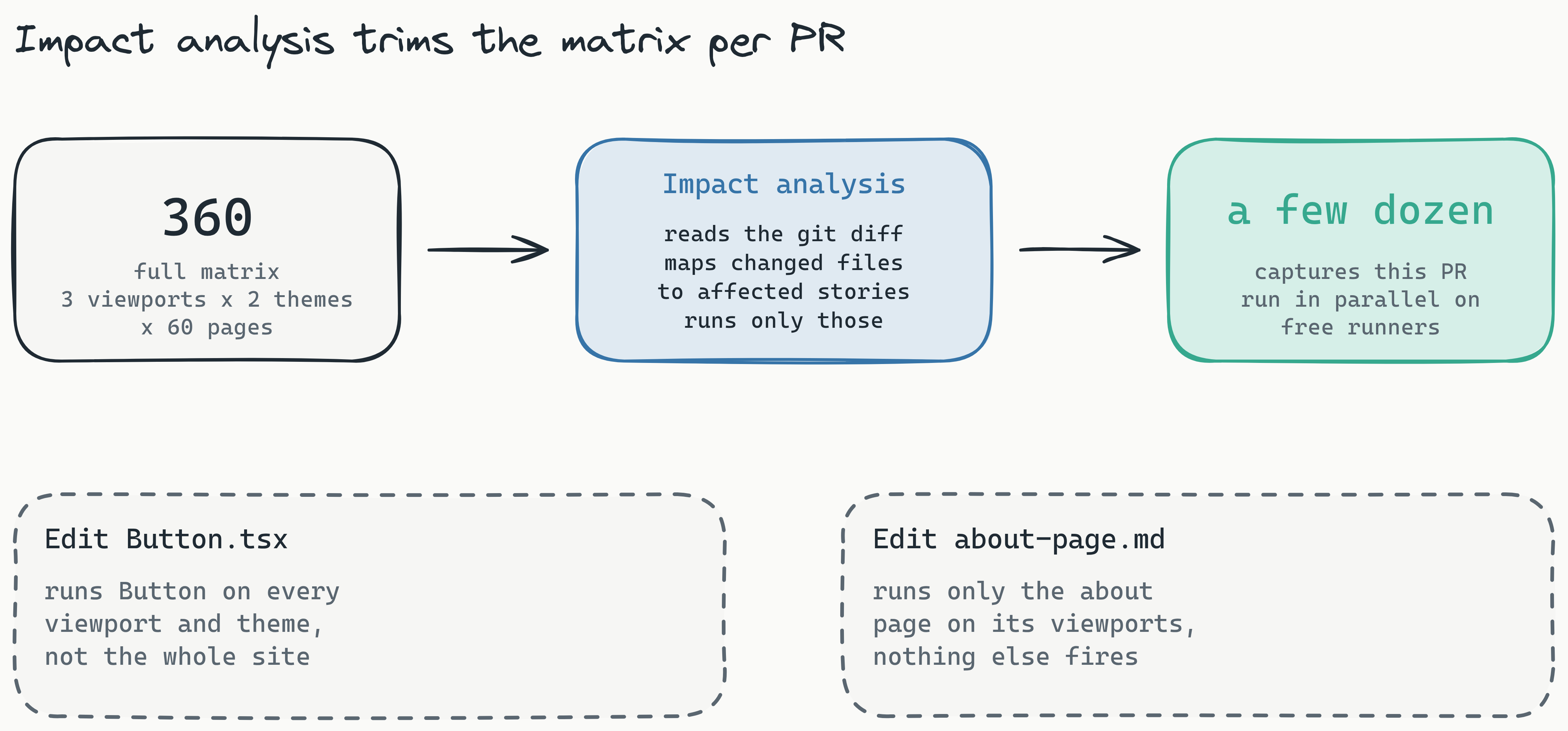
Three viewports × two themes × 60 pages = 360 baselines. With Lastest those run in parallel on free runners, and the impact-analysis layer trims the matrix per PR. A typo in a button component runs Button on every viewport; a copy change to about-page.md runs only the about page. Most PRs trigger a few dozen captures, not hundreds.
Responsive coverage is not optional anymore - it is what your users actually see. Build the matrix once, automate the capture, and stop relying on "I checked it in dev tools."