The night a team ships dark mode is also the night their visual coverage halves. Every component, every page, every modal - there are two of them now, and only one is being snapshotted. Worse: most dark-mode bugs are not "the whole page is wrong." They are subtle. A single token forgot to swap. A stroke stayed at #000 instead of currentColor. A focus ring vanishes against a dark background.
This guide shows the structure that makes multi-theme visual testing tractable: a theme matrix that scales sub-linearly with cost, per-theme baselines that share the same diff config, and a workflow that catches the bugs that matter without exploding CI time.
Why naïve doubling is wrong
The first instinct when adding dark mode is to fork every existing test: navbar.light.spec and navbar.dark.spec. CI run time doubles. Maintenance doubles. False positives also double, because every flake now happens twice. After a sprint of this, teams quietly delete the dark-mode tests.
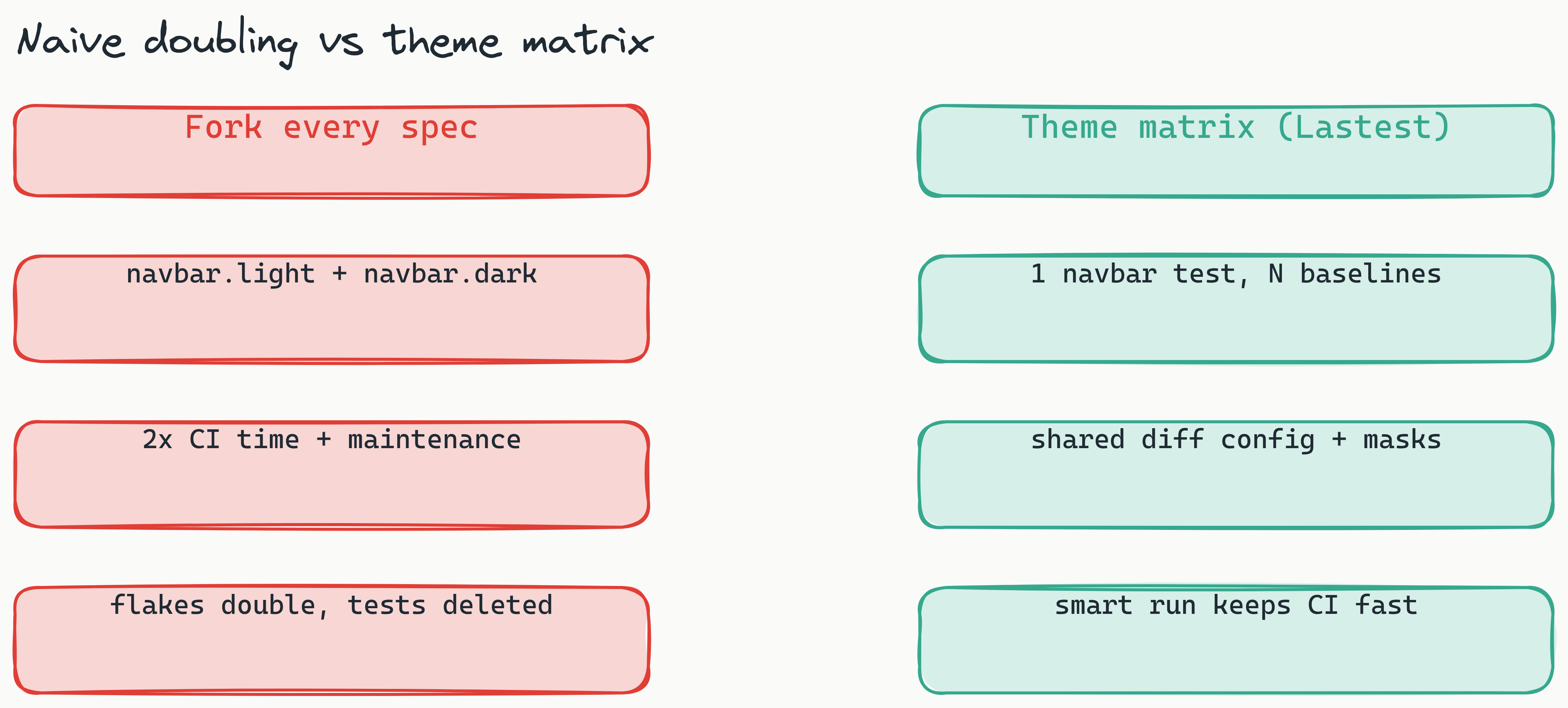
The right model is a theme matrix: tests are theme-agnostic; the runner enumerates themes per test. A single navbar test produces N baselines for N themes, sharing diff config, masks, and stabilization.
Setting up the matrix
Tell Lastest which themes exist and how to switch them.
# lastest.config.yaml
themes:
  - name: light
    setup: |
      document.documentElement.dataset.theme = 'light'
  - name: dark
    setup: |
      document.documentElement.dataset.theme = 'dark'
  - name: highContrast
    setup: |
      document.documentElement.dataset.theme = 'hc'
applyToAll: true
Now every test in the suite runs three times. The runner waits for the theme attribute to apply, repaints, and screenshots. You get one test definition and three baselines.
Three switching strategies - and which to pick
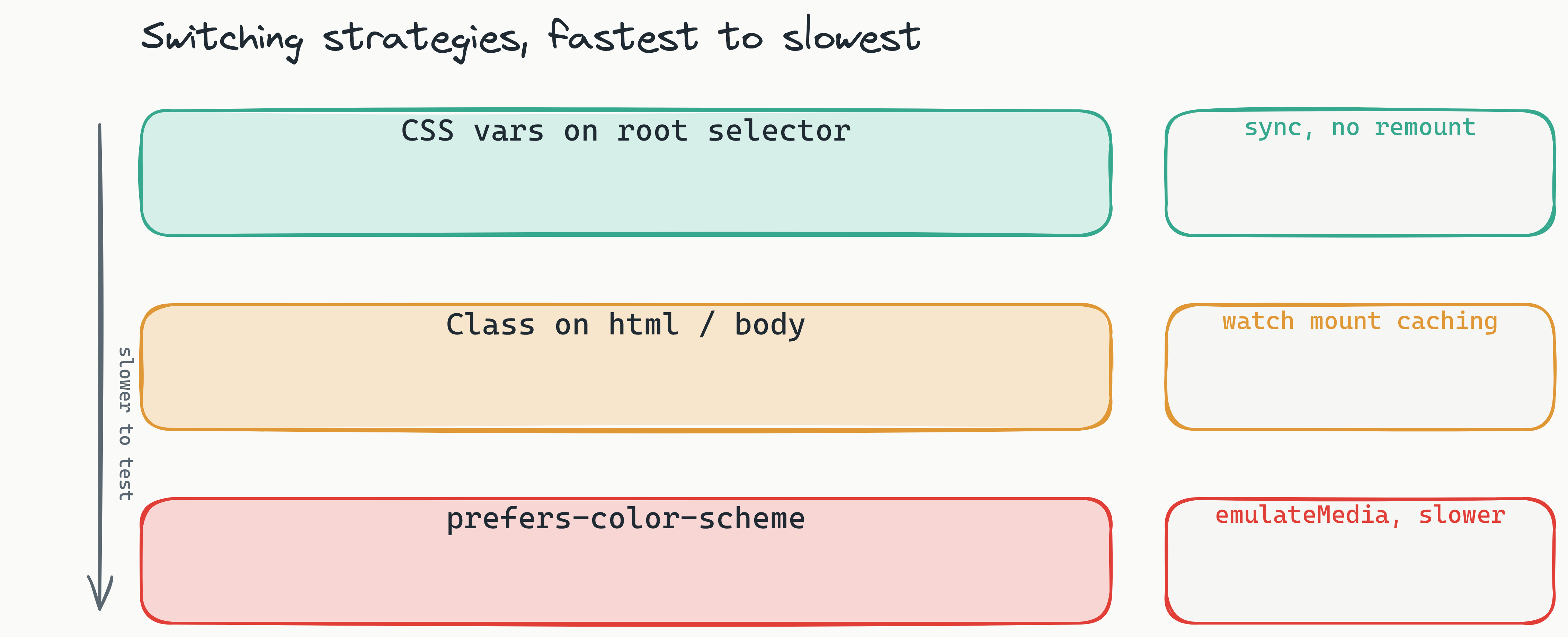
- CSS variables on a root selector. Best for visual tests. Switching is synchronous, no remount, no re-fetch. Tests stay fast.
- Class on
<html>/<body>. Almost as good. Watch for libraries that read the class on mount and never re-read it. - System
prefers-color-scheme. Hardest to test. The runner has to override the media query at the browser level - Lastest does this withpage.emulateMedia(), but it is slower than DOM-only switching.
Use perceptual diffs for theme tests
Dark UIs are antialiasing-noisy. A pixel diff will flag every soft shadow that re-renders 1 px differently across runs. Configure dark-theme baselines to use the perceptual engine and reserve pixel-perfect for icons and design-system swatches.
The bugs you actually catch
- Hardcoded colors.
color: #111looks fine on light, vanishes on dark. - Missing focus rings. Outline contrast that works on white is invisible on near-black.
- SVG icons with baked fills. Forgot to use
currentColor. - Disabled states. The 50%-opacity trick fails when the underlying surface changes.
- Borders. A 1-px
border-color: rgba(0,0,0,0.1)disappears on dark.
Smart selection keeps CI fast
You do not need every test on every theme on every PR. Lastest's impact analysis maps changed files to affected stories. A change to Button.tsx runs Button on N themes; a change to tokens.css runs everything. Most PRs trigger far less than the full matrix, so total CI time stays low even as your theme count grows.
Two themes is the dangerous moment. Three is when teams give up unless the suite is structured. Build the matrix once, share baselines per test, and theming becomes a feature you actually ship instead of a feature you regret.